The Doorway in the Frame: How Composition Directs Your Eye
Learn how doorway framing directs attention and shapes screen space, so you can read a film’s visual choices without leaning on plot clues.
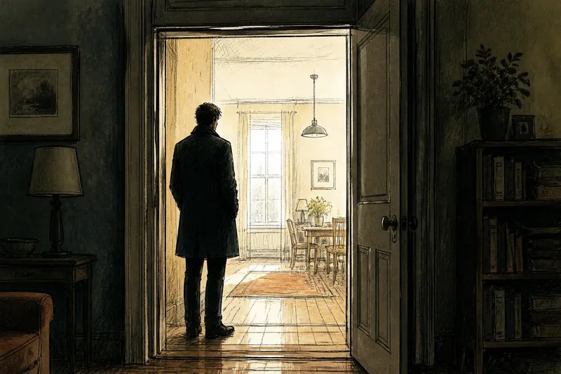
A doorway in a film frame can make a character look isolated, watched, or simply easier to notice. Doorway framing directs your eye through borders, depth, and light—not through a hidden plot clue. If the composition feels confusing, start by asking what the image makes easiest to see.
Doorways are useful because they divide the screen into visible zones: the room behind the camera, the threshold, and the space beyond. A filmmaker can make those zones feel connected or sharply separate. Here are common viewing snags, what may cause them, and what to try instead.
Why does the character disappear into the doorway?
A figure can seem to vanish even when they stand near the center of the frame. The doorway may be darker or busier than the person, or the doorframe may cut across the body and break up its outline. Your eye tends to follow contrast and clear shapes, so a bright wall or a sharp edge can compete with a face.
Try comparing the character’s outline with the space around them. Is a dark jacket merging with a shadowed room? Does a pale doorframe cross the shoulder, making the body harder to read? Notice which area has the clearest contrast, then see whether the film holds your gaze there or shifts attention elsewhere.
Imagine a character in a dark coat standing inside a dim apartment while a bright hallway fills the doorway. The filmmaker could keep the hallway bright and let the person recede, making the empty passage the strongest shape. If the image instead gives the character a strip of light along the face, the figure becomes easier to pick out without changing their position.
Why does the room feel flat instead of deep?
A doorway suggests depth, but it does not create it by itself. If the near doorframe, the character, and the distant wall all have similar sharpness, brightness, and scale, the image may read like a flat arrangement. The opening then behaves more like a graphic rectangle than a passage into another space.
Look for cues that separate near from far: a frame edge larger in the foreground, a smaller figure beyond it, or a visible strip of floor leading into the room. Differences in focus and light can also help. Try tracing a path from the nearest edge to the farthest visible surface; if the eye has nowhere to travel, the frame may be emphasizing shape over depth.
It is not worth trying to infer the camera’s exact lens or position from a single shot. Those details can be hard to establish from the image alone. Stick to what is visible: which planes overlap, what looks close, and whether the opening feels like an entrance or a flat border.
Why does the doorway feel like a barrier?
Sometimes the opening reads less like a route and more like a wall. A closed door, a narrow gap, a thick frame, or a character pressed against one side can make the threshold feel restrictive. The effect comes from the space the composition leaves available, not necessarily from what the character intends to do.
Notice how much of the opening remains visible and whether the character occupies it or stands beside it. A centered figure may seem presented to the viewer; a figure squeezed against the jamb can feel boxed in. Also check whether the camera shows the room beyond clearly. A dark or obstructed interior can make the doorway feel less inviting than an open, legible space.
To test your reading, look at the edges rather than guessing from the scene’s events. Is the character’s body blocked by the frame? Does the camera leave room for them to move within the image? These choices can suggest access or restriction without proving anything about the story.
Why does the composition feel awkward or unbalanced?
A doorway can pull attention so strongly that the rest of the frame seems to tip toward it. This may happen when the opening sits near an edge, when its vertical lines dominate, or when a large empty area opposite it has no visual counterweight. But imbalance can be deliberate: a lopsided image may make the character seem exposed or make the room feel unsettled.
Try locating the frame’s strongest shapes before deciding the shot is messy. Compare the doorway’s size with the character, then notice whether a lamp, window, or patch of light answers its visual weight elsewhere. A small detail can balance a large dark opening if it has enough contrast.
For instance, imagine a character standing at the far left of a wide room, framed by a doorway, while a bright window occupies the right. The two openings may pull your gaze back and forth, making the empty room feel broad. If the window is dimmed or partly hidden, the doorway may dominate and the same room may feel more compressed.
How can you read doorway framing without guessing?
Keep your description close to the image. “The frame hides part of the room” is more precise than “the room is hiding something.” Separate what you can point to—contrast, overlap, empty space—from what you think it might mean. That distinction lets you discuss visual craft without turning every rectangle into a symbol.
What should I look at first in doorway framing?
Find the character, the nearest doorframe edge, and the farthest visible surface. Then notice which has the strongest contrast or clearest outline. That gives you a starting point for describing where the image directs attention.
Does a character framed by a doorway always seem isolated?
No. A doorway can isolate a figure if it separates them from the surrounding space, but a crowded room or a wide, open threshold may make the character feel connected to it. Read the visible arrangement rather than assigning one fixed meaning.
How does camera position change the effect?
A view from inside a room can make the doorframe feel close to the viewer, while a view from the hall may show more of the room beyond. Height and angle also change which edges overlap the character. Describe the apparent position of the camera without claiming certainty about how the shot was made.
How can I describe the effect in a film discussion?
Name a visible choice and its immediate effect: “The dark jamb cuts across the figure, so the bright room beyond catches my eye first.” This links composition to attention without treating the image as a coded message. If another viewer sees the character first, compare which contrast or shape each of you noticed.
What is the simplest way to make a careful reading?
Watch the shot once for its overall balance, then replay it and track the doorway’s edges, the character’s outline, and the visible depth beyond. Ask where your gaze lands first and whether it moves. You can then describe how the frame organizes attention and space, while leaving room for other readings.
The doorway is not a clue with one correct answer; it is a set of lines and spaces arranged around a person. A useful reading stays specific: the opening narrows the view, the foreground edge blocks part of the body, or the bright hall pulls attention away. That is enough to notice what the composition is doing before deciding what, if anything, it means.